1909 Original
A sun-forward design direction that reminds us simple symbols often read faster than seals.
Public Design Story
South Dakota deserves a flag that can be recognized in an instant: on a pole, a jersey, a storefront, a patch, or a tourism campaign.

This swipe edition walks through the case one idea at a time, then invites a public vote.
The Problem
A seal is for documents. A flag is for distance.
South Dakota's current flag asks people to read a seal. That is a lot to ask at 50 feet, and nearly impossible at 200 feet.
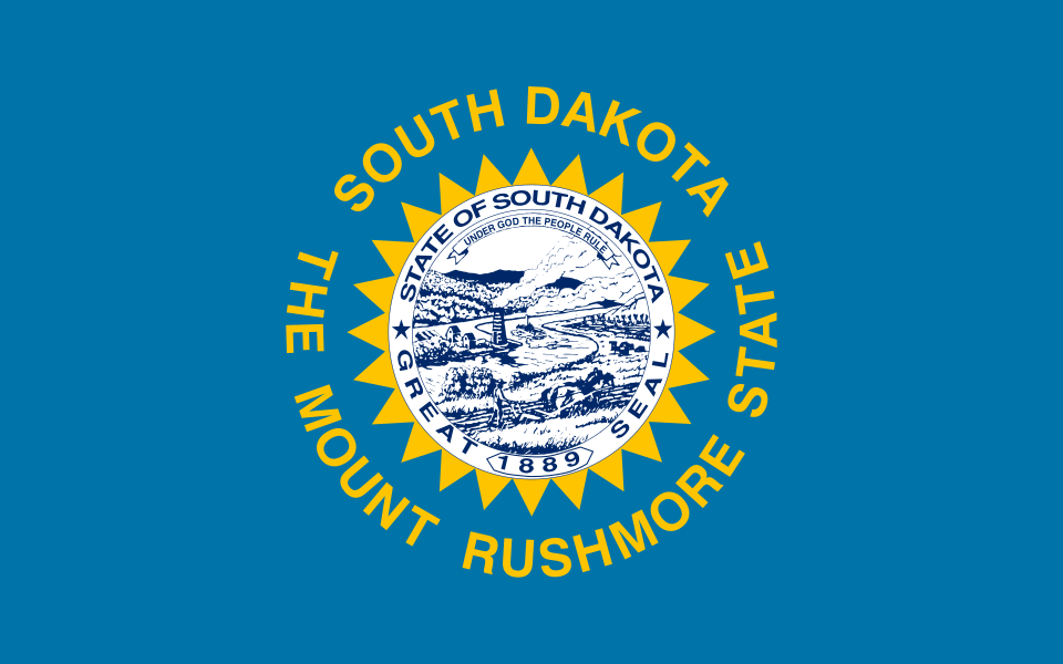
Current flag: meaningful up close, but visually crowded from far away.
Past Flags
The point is not change for novelty. The point is improvement: clearer identity, stronger recognition, and a design people can carry proudly.
A sun-forward design direction that reminds us simple symbols often read faster than seals.
The modern flag still depends on the Great Seal and circular lettering, which are difficult to identify from distance.
A small counterpoint: the no-words 1909 version, shown in the main site, fits the basic flag rules better - no words, one bold symbol, easy to identify from afar, and a cleaner way to reflect South Dakota's people and culture.
Read the brief flag historyOld vs. New
Current flag: official, detailed, difficult at distance.
Rich's Submission
Buffalo and Black Hills Spruce speak to West River. Pheasant, corn, soybean forms, and a deciduous tree speak to East River. The Missouri River connects both halves beneath the South Dakota sun.
Rich's view: this design is the final recommendation on the site, offered to encourage public debate and refinement.
Personal Note
The goal is public discussion around what is a flag versus what is a seal. A flag should be identifiable from a distance and use color to tell a story. Rich's 3.0 design is the recommendation on this site, while still inviting public debate and refinement.

The important part is asking the question in public while giving people a concrete recommendation to react to.
Open the full-page version