A Civic & Economic Initiative

It's Time for a New
South Dakota Flag

Bold enough to be seen. Simple enough to be remembered.

We believe a flag and its design should tell a story. We believe you can help us tell a better story.

See the case & vote

Past State Flags

South Dakota Has
Changed Its Flag Before.

The question is not whether a flag can evolve. It already has. The question is whether the next change finally makes the flag clearer, more memorable, and more useful as a symbol for South Dakota.

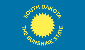
South Dakota's original 1909 state flag

1909: The Original Flag

South Dakota's first official flag used a sun motif on one side and the state seal on the other. It already understood something important: a flag needs a bold symbol.

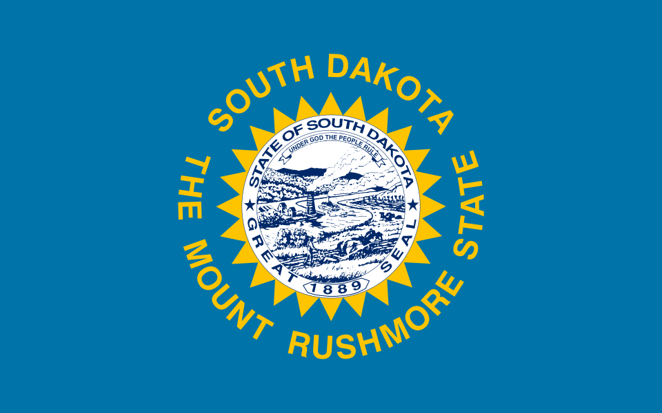
Current South Dakota state flag

1992: A New Nickname, Same Problem

The wording changed to "The Mount Rushmore State," but the basic seal-on-blue approach remained. It still struggles at distance, on merchandise, and in small digital spaces.

South Dakota's original state flag

A quick source for the backstory.

The unofficial SoDak Governors history of South Dakota's flag walks through the 1909 original, the 1963 redesign, and the 1992 nickname update. The lesson is simple: we have changed it before. This time, we can do better.

South Dakota's original state flag without words

Why the no-words version still matters.

This cleaner 1909 direction makes the flag argument more obvious: no words, one clear symbol, easy to identify from afar, and a simpler way to represent South Dakota's people and culture than the current seal-heavy flag.

Design Progression

From Flag Principles
to a South Dakota Story.

The design path starts with the basic flag question popularized by CGP Grey-style critiques: can it be recognized from far away? From there, the concept moves into a sun-and-Missouri-River identity, then into Rich's 3.0 final recommendation.

CGP Grey-inspired South Dakota flag concept

Step 1: CGP Grey-Inspired Concept

A cleaner flag-study direction influenced by modern flag-design principles: stronger symbols, fewer moving parts, and better distance readability.

Inspiration: CGP Grey YouTube video
Solar Horizon South Dakota flag concept

Step 2: Solar Horizon

The next simplified direction: a bold sun, Dakota blue, and a Missouri River form. This concept helped establish the color story and the distance-test logic.

Rich's 3.0 South Dakota flag design

Rich 3.0 design explained

This design serves as a visually striking, deeply meaningful representation of South Dakota's rich heritage, diverse geography, and cultural identity. By combining clean vexillological geometry with symbolic regional elements, the artwork tells a complete story of the state from West River to East River.

West River East River Buffalo Pheasant Missouri River Sunshine State
  • West River: The bison, Indigenous pattern work, and Black Hills Spruce anchor the left side in prairie, tribal heritage, and western geography.
  • East River: The ring-necked pheasant, soybean-inspired feather forms, corn stalk, and deciduous tree point to agriculture and eastern river valleys.
  • Unified center: The Missouri River ties both halves together beneath a South Dakota sun, using a controlled blue, gold, and river-blue palette.

Other designs submitted

We want this to be a community engagement effort, and we would love to have artists submit their own designs.

Click any design image below to load it into the distance comparison after this section.

South Dakota flag concept option South Dakota flag concept option South Dakota flag concept option South Dakota flag concept option South Dakota flag concept option South Dakota flag concept option South Dakota flag concept option South Dakota flag concept option South Dakota 1909 flag without words

Old vs. New

A Flag Is Not a Seal.
They Serve Different Purposes.

A state seal belongs on a document - up close, packed with historical detail. A flag belongs on a pole, a jersey, a storefront. It must be instantly readable from 100 feet away. Right now, South Dakota's flag fails that test completely.

✗ Current Flag — 1992
Current South Dakota state flag

The problem: South Dakota's 1992 flag crams the entire Great Seal - farmsteads, steamboats, miners, and legal text - onto a blue field nearly identical to dozens of other states. On a flagpole at 50 feet it is an unreadable smudge. The seal belongs on documents, not flags.

✓ Rich's Final Design — Subject to Public Vote
Rich's 3.0 South Dakota flag design

The opportunity: A narrative-driven redesign that still keeps the flag language clean: South Dakota blue, a unified Missouri River, a Sunshine State sun, West River heritage, East River agriculture, and symbols that tell the state's story without text or a seal.

The Distance Test - How Flags Are Actually Seen

Flags are not read - they are recognized in an instant. As distance increases, fine detail collapses into noise. A seal designed for close inspection becomes invisible on a flagpole. A bold symbol holds its identity at every scale.

Current South Dakota flag up close
Up close
Current South Dakota flag at 50 feet
50 ft
Current South Dakota flag at 100 feet
100 ft
Current South Dakota flag at 200 feet
200 ft
Rich's 3.0 flag design up close
Up close
Rich's 3.0 flag design at 50 feet
50 ft
Rich's 3.0 flag design at 100 feet
100 ft
Rich's 3.0 flag design at 200 feet
200 ft

At 200 feet, the current flag becomes an anonymous blue field. Rich's 3.0 design keeps its main read: blue field, gold state symbols, and a central river shape.

Rich 3.0 design explained

This design serves as a visually striking, deeply meaningful representation of South Dakota's rich heritage, diverse geography, and cultural identity. By combining clean vexillological geometry with symbolic regional elements, the artwork tells a complete story of the state from West River to East River.

Here is a breakdown of the artistic elements and symbolism woven into Rich's 3.0 recommendation.

1. The Mighty Buffalo & Indigenous Heritage (Left / West River)

The Buffalo: Standing strong on the left, the American bison represents the vast prairies, the history of the West River region, and the resilient spirit of South Dakota.

Native American Artistry: The shading and line work inside the buffalo are intricately detailed with traditional geometric patterns, spiral motifs, and an eagle/thunderbird silhouette. This pays deep, beautiful homage to the state's nine federally recognized tribes and the profound spiritual and historical connection between the indigenous peoples and the bison.

The Black Hills Spruce: Towering behind the buffalo is a majestic evergreen, specifically styled after the Black Hills Spruce, the official state tree. It anchors the left side of the flag in the rugged, forested geography of western South Dakota.

2. The Ring-Necked Pheasant & Agriculture (Right / East River)

The Pheasant: On the right stands the ring-necked pheasant, the state bird, celebrated both as a proud symbol of South Dakota's world-class wildlife heritage and its vibrant outdoor traditions.

Soybean Shading: The delicate patterns inside the pheasant's feathers incorporate leafy, organic soybean forms, celebrating one of the state's most vital agricultural staples.

The Corn Stalk: Standing directly beside the pheasant is a crisp, detailed corn stalk complete with developed ears. This symbolizes the heart of South Dakota's agricultural engine, abundance, and the rich soil of the East River plains.

The Eastern Deciduous Tree: Behind the agricultural scene stands a full, leafy deciduous tree, reminiscent of the cottonwoods and bur oaks common to eastern river valleys, balancing the evergreen on the left.

3. The Central Unified Elements

The Winding River: Sweeping through the center is a winding blue river. Geographically, it represents the Missouri River, which physically cuts through the heart of South Dakota. Artistically, it serves as the ultimate unifier, connecting the distinct landscapes and stories of the East and West.

The South Dakota Sun: High in the sky sits a classic geometric sun with sharp, radiating rays. This nods to South Dakota's longtime identity as the Sunshine State, beaming warmth, growth, and optimism over the entire unified landscape.

The Color Palette: The backdrop uses authentic South Dakota blue, honoring the state's flag lineage. By restricting the rest of the artwork to golden yellow and lighter river-blue accents, the flag maintains a professional, modern, cohesive look that reads beautifully from a distance.

It is an intentional, narrative-driven redesign that balances simplicity with deep cultural and geographic substance.
Opinion Poll

Which Direction Should
South Dakota's Flag Take?

This informal poll is meant to collect feedback before the proposal is shared more broadly. Vote for Rich's 3.0 design, one of the primary concepts, the current flag, the no-words 1909 variation, or another direction from the broader concept set. Your vote opens a quick pop-up for email and optional notes.

🔒  Online collection ready  ·  Optional comments help shape the final recommendation
Rich's 3.0 South Dakota flag design
Option A
Rich's 3.0 Design
The final recommendation: buffalo, Black Hills Spruce, pheasant, agriculture, Missouri River, and South Dakota sun in one unified flag.
Votes: 0
CGP Grey-inspired South Dakota flag concept
Option B
CGP Grey-Inspired Concept
A simplified flag-study concept based on modern flag-design principles: clear symbols, readable distance identity, and fewer competing details.
Inspiration: CGP Grey YouTube video
Votes: 0
Solar Horizon South Dakota flag concept
Option C
Solar Horizon
The early clean concept: a gold sun over South Dakota blue with a Missouri River form. Simple, optimistic, and strong from a distance.
Votes: 0
Alternate South Dakota flag concept
Option D
Another Concept Direction
You like the broader design exploration, but prefer one of the other visual approaches instead of the three primary designs.
Votes: 0
Current South Dakota state flag
Option E
Keep the Current Flag
Retain the 1992 flag with the Great Seal and "The Mount Rushmore State" inscription. Preserve the status quo.
Votes: 0
South Dakota's original state flag
Option F
Return Toward the Original
Use the 1909 flag's original sun-forward spirit as the guide. South Dakota once had a simpler symbolic direction worth reconsidering.
Votes: 0
South Dakota 1909 flag without words
Option G
1909 No Words
A cleaner return toward the original 1909 direction, with the text removed so the sun and symbol read more clearly at distance.
Votes: 0
? YOUR DESIGN HERE SUBMIT BELOW TO BE CONSIDERED
Option H
Open Call - New Design
Neither option feels right. South Dakota deserves something entirely fresh. Open the design challenge and let citizens submit proposals.
Votes: 0

Opinion Poll Snapshot

Select a design, enter your email in the pop-up, and confirm your vote to reveal the live poll results.
A — Rich 3.0
0
B — CGP Grey
0
C — Solar Horizon
0
D — Other Concept
0
E — Keep Current
0
F — Original Flag
0
G — 1909 No Words
0
H — Open Call
0
Total votes cast: 0

✓  Thank you. Your feedback helps shape what gets recommended for South Dakota.

The Business Argument

A Simple Flag Is a
Free Economic Asset

The Great Seal stays — on legal documents and government filings where it belongs. A redesigned flag gives South Dakota a bold commercial identity that works for farmers, tourism operators, and manufacturers who want to put South Dakota on a label.

🌾

"Made in South Dakota"

A clean flag becomes a brand mark for local agriculture and products — the way Texas and Maryland businesses leverage their flags as instant regional identity.

🏔

Tourism Identity

Tourism is our top economic driver. A recognizable symbol on merchandise and social media multiplies every marketing dollar spent attracting visitors.

🛍

Retail & Merchandise

A bold design prints cleanly on apparel, stickers, and products at any price point — a market the current complex seal simply cannot serve at scale.

💼

Workforce Recruitment

A distinct identity helps South Dakota stand out to remote workers and professionals making location decisions — pride of place starts with a symbol.

💲

Zero Upfront Cost

No agency replaces patches or letterheads immediately. The new design phases in naturally as existing assets reach end-of-life — zero fiscal burden.

🏛

The Seal Is Preserved

South Dakota's Great Seal remains on official documents and government correspondence — honored, intact, and in its proper context.

Open Design Challenge

Submit Your Vision
for South Dakota

Designers, artists, students, tribal members, and all South Dakotans — your concept could be presented to the volunteer committee and ultimately to state legislators. This is your flag too.

📋 What to Include

  • Your artwork file — JPG, PNG, PDF, SVG, or other common image format. Higher resolution is better for review.
  • Design rationale — Colors, symbols, and what South Dakota heritage elements you honored.
  • Your name & contact info — So we can credit you and follow up if selected by the committee.

This jumps you down to the actual upload form below. You can vote separately at the top of the page.

📎 Design Submission Form

Attach the image file you want reviewed. If you have multiple versions, send your strongest one first.
Submissions go to a hosted form endpoint. Set `submissionEndpoint` in `assets/sd_flag_data.js` to make sending live.
Fill out the form and attach your design. Then send it for review.

A Personal Note

Rich's 3.0 design is the final recommendation.

The real purpose of this initiative is public discussion: what is a flag, and what is a seal? A seal can be detailed, official, and ceremonial. A flag has a different job. It should be easily identifiable from a distance, use color to tell a story, and be simple enough that people can remember it, draw it, wear it, and rally around it.

The simpler, the better. Rich's 3.0 design is presented here as the site's final recommendation, while still inviting public debate about how South Dakota can tell its story through a single image on a flag.

The goal is to think forward: how can South Dakota be represented in a visible, motivating, and promotable way that works on a flagpole, a storefront, a jersey, a patch, a product label, or a tourism campaign?

The South Dakota Seal

We appreciate the Seal very much.

The Seal of South Dakota deserves its proper recognition. It belongs on letterhead, official documents, and other close-range uses where people can see it clearly. The Governor should be stamping the Seal on every letter that leaves the Governor's mansion across from the Capitol in Pierre.

That said, even a beautifully designed seal can still work against a flag when it is scaled up for distance. A seal and a flag do different jobs, and each deserves to live in the format where it works best.