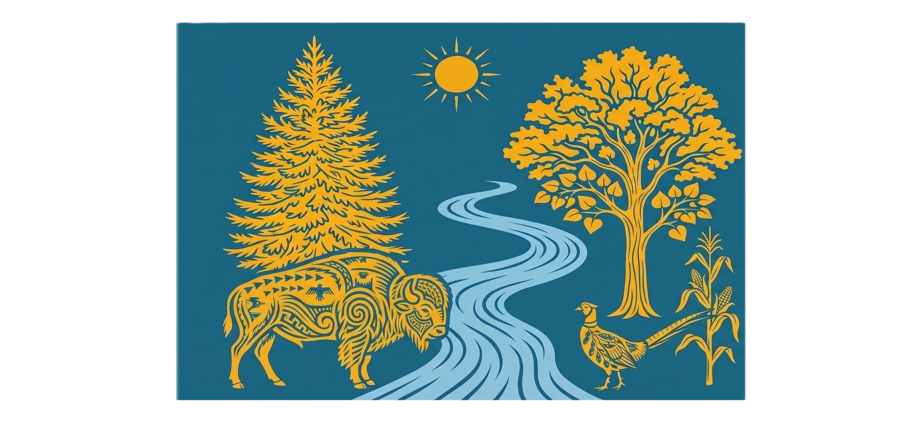
Rich's design explained
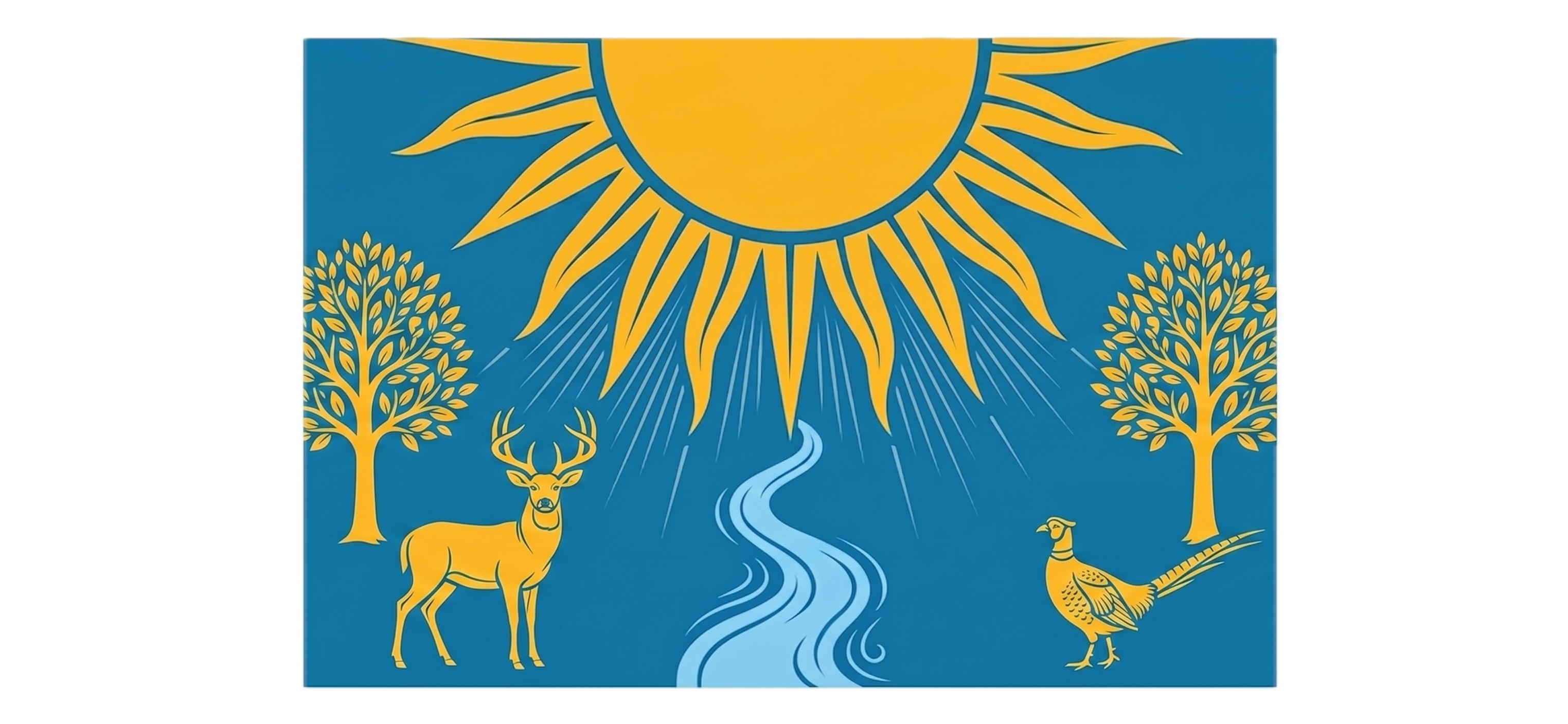
This design serves as a visually striking, deeply meaningful representation of South Dakota's rich heritage, diverse geography, and cultural identity. By combining clean vexillological geometry with symbolic regional elements, the artwork tells a complete story of the state from West River to East River.
Here is a breakdown of the artistic elements and symbolism woven into Rich's final submission.
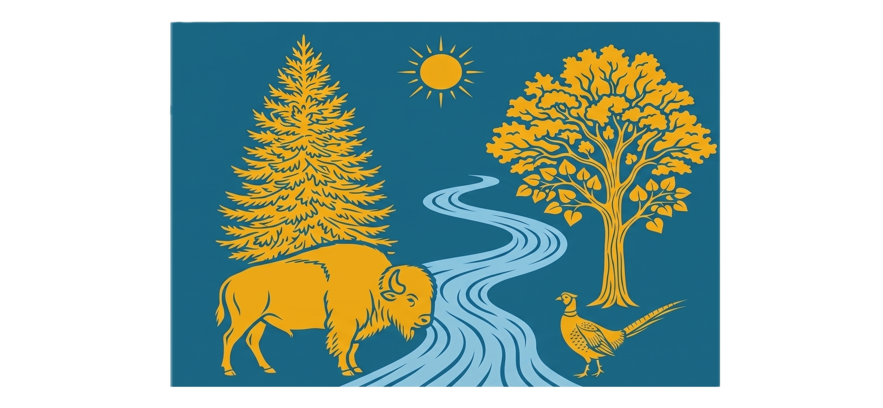
1. The Mighty Buffalo & Indigenous Heritage (Left / West River)
The Buffalo: Standing strong on the left, the American bison represents the vast prairies, the history of the West River region, and the resilient spirit of South Dakota.
Native American Artistry: The shading and line work inside the buffalo are intricately detailed with traditional geometric patterns, spiral motifs, and an eagle/thunderbird silhouette. This pays deep, beautiful homage to the state's nine federally recognized tribes and the profound spiritual and historical connection between the indigenous peoples and the bison.
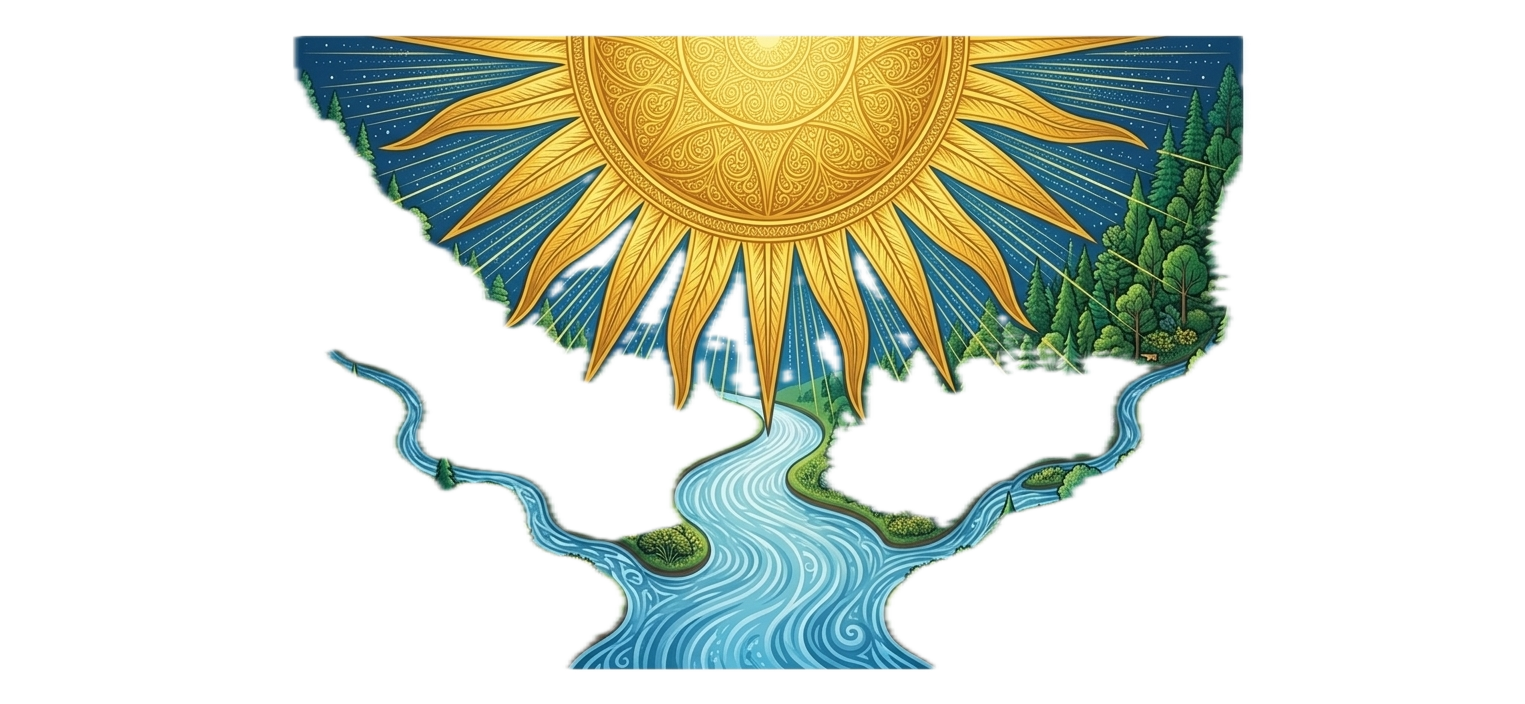
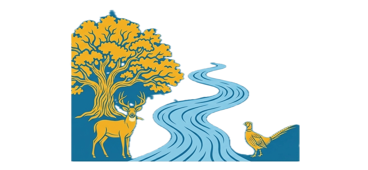
The Black Hills Spruce: Towering behind the buffalo is a majestic evergreen, specifically styled after the Black Hills Spruce, the official state tree. It anchors the left side of the flag in the rugged, forested geography of western South Dakota.
2. The Ring-Necked Pheasant & Agriculture (Right / East River)
The Pheasant: On the right stands the ring-necked pheasant, the state bird, celebrated both as a proud symbol of South Dakota's world-class wildlife heritage and its vibrant outdoor traditions.
Soybean Shading: The delicate patterns inside the pheasant's feathers incorporate leafy, organic soybean forms, celebrating one of the state's most vital agricultural staples.
The Corn Stalk: Standing directly beside the pheasant is a crisp, detailed corn stalk complete with developed ears. This symbolizes the heart of South Dakota's agricultural engine, abundance, and the rich soil of the East River plains.
The Eastern Deciduous Tree: Behind the agricultural scene stands a full, leafy deciduous tree, reminiscent of the cottonwoods and bur oaks common to eastern river valleys, balancing the evergreen on the left.
3. The Central Unified Elements
The Winding River: Sweeping through the center is a winding blue river. Geographically, it represents the Missouri River, which physically cuts through the heart of South Dakota. Artistically, it serves as the ultimate unifier, connecting the distinct landscapes and stories of the East and West.
The South Dakota Sun: High in the sky sits a classic geometric sun with sharp, radiating rays. This nods to South Dakota's longtime identity as the Sunshine State, beaming warmth, growth, and optimism over the entire unified landscape.
The Color Palette: The backdrop uses authentic South Dakota blue, honoring the state's flag lineage. By restricting the rest of the artwork to golden yellow and lighter river-blue accents, the flag maintains a professional, modern, cohesive look that reads beautifully from a distance.
It is an intentional, narrative-driven redesign that balances simplicity with deep cultural and geographic substance.